Use Journey Mapping to Increase Web Form Conversion Rates

Design a User-Centric Journey for Conversion!

By David Pfeiffer

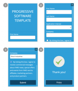
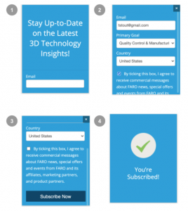
User-Centric Journey for Web Forms

Are your web forms converting above the typical rates?

Assuming your SEO efforts bring relevant traffic to your website, you should expect a healthy form completion rate. If not, read this article on how to present the right form at the right time.

Emotional Decision Making 

Although we think of ourselves as highly rational decision-makers, behavioral scientists have repeatedly shown that we take our emotions into account when making decisions. Without some emotional input, we tend to dither over small details and endless comparisons, thereby making no decisions. A no-pain, emotive message is important to high form conversion rates.

Better User Experience leads to more Conversions

Web forms work together with the psychology of activation and selling to increase user experience and conversion rate. UX produces significant gains in conversion rate as illustrated by the Search Engine Watch article.

The EAST framework (illustrated in the table on the right) models how UX and persuasion are applied to increase form conversion rates.

In this article, the “Make it Timely” aspect of the user’s journey will be explored as a sitewide marketing funnel.

The companion article titled “Pre-suasion Web Form Design” will outline how the other principles are used in Form Design.

UX and Motivation work together to create effective conversion rates

Derived from: Behavioural Insights Team

Mindset Personas mapped to Marketing Funnel

Mindset Persona Journey

If you have a poor forms conversion rate, you might be showing the wrong form at the wrong time. For example, placing a gated content form on the home page will convert poorly. This is because low-consideration visitors are not ready to exchange their personal info for something they have not determined they want or need. Gated forms convert much better on internal pages or on landing pages connected directly to the pay-per-click campaign.

It’s all about Mindsets

It’s important that forms are designed for the mindset and consideration level of the buyer/user during their journey on your website. The Nielsen-Norman eCommerce persona model is very useful as mindset personas allow us to classify and align their needs and wants to the marketing funnel as illustrated in the diagram above.

The marketing funnel and mindsets illustrate the switch from a Browser to a Researcher and then to a Product/service-focused buyer mindset. This might happen as the user reviews the site or the user could come to the site as someone already in the middle or end of the funnel because of search results or pay-per-click ads. Either way, it is useful to use this conceptual framework in the menu, page, and form design.

Let’s expand on this concept, turning the marketing funnel on its side to see how the entire site can work together.

Mindset-base Journey Map

It is useful to map the user’s mindset to pages that support the goals of each stage of the marketing funnel. This is illustrated by the diagram on the right for both content marketing and e-commerce sites.

Page Types in the Journey Map

Here the goals of the home page and main menu surface the low consideration pages first to invoke hot cognition and navigation to a deeper experience.

The more detailed pages and interactions are presented when their mindset moves from a Browser to the Research and Product mindsets. This approach provides a strong menu architecture and content strategy framework.

Journey Jumping

The user may come to the site in a researcher or product-focused mindset. In this case, they would use the main menu or site search engine to find a point in the journey that satisfies their needs.

Website pages mapped to the Marketing funnel

Note: At this point, you might be wondering; what is the difference between “mindset personas” and my “needs personas”? How does the “needs personas” fit into this model? The “needs personas” drive the pages behind page type.

Form Types mapped to Page Types in the Marketing funnel

Form Placement in the Journey Map

Now, let’s add the content marketing forms to the mindset journey map (see diagram on left). The diamonds in the diagram represent the positioning of various forms in a content marketing journey and the mindset they belong to.

The form data facilitates the value exchange between the website and the user – valuable content for personal information.

The rest of this article will discuss the right form types for each mindset in the overall journey. Not all e-commerce sites have content marketing pages but should have if they want to optimize SEO.

The Number of Fields and Conversion Rate Considerations

One of the most important considerations in form completion is the number of form fields presented to the user. As you can see in the diagram, 2-3 fields are the sweet spot for quick and easy data gathering.

After the field count goes above 5, the conversion rate starts dropping quickly due to consideration of mindset and cognitive load. 

This is especially important for Pay-per-click (PPC) campaigns. If you are buying a broad set of keywords for the browser mindset, you would direct them to a low-consideration landing page with a simple form and links to related pages. If your PPC program is for very specific keywords, you might direct them to a product sales page or product details page (PDP) with many form fields.

Heuristic: The more form fields, the deeper the form would be in the journey.

Conversion Hack – Ways to Reduce the Number of Form Fields

Data Enrichment

I have never known a sales and marketing team that did not want to add fields to web forms, but as described above, this will reduce the form completion rate. One great way around this is to use data enrichment services (e.g., Clearbit, D&B) to validate the information provided in the form and to fill in desired extra information. Yes, data enrichment will cost a nominal fee, but it serves two useful purposes; 

  1. It forces the team to consider the real value of extra information
  2. It’s a great way to validate form data

Assuming you gather an email address or a LinkedIn URL for the user, There are many services that will find and/or validate the email address (e.g., Snov.io, AnyMailFinder.com, etc.). These email services provide some personal info as well. 

Of course, you can also purchase extensive profiles from companies like: 

  • ClearBit, Experian, FullContact (Retail)
  • LeadGenius, DiscoverOrg, ZoomInfo, Lusha (B2B)
  • Dun and Bradstreet

Make sure that your data enrichment, storage, and usage practices comply with Data Privacy standards (e.g., GDPR, CCPA, etc.) that you support.

Multi-Step Form

While a Multi-step form may not reduce the number of fields, presenting a smaller number of fields to the user reduces cognitive load and the resistance to the overall form completion.

Consider using Multi-step forms when your field count is greater than 5 fields. A two-page multi-step form will typically increase conversion by about 14%.

The first page of a Multi-step Form

Tip: Make the lead page interesting and single click to get the user started.

Top-of-Funnel

Browser Mindset Forms

The Browser mindset is looking for something relevant, interesting, or inspiring on the path to becoming a Researcher. In your journey design, Browser pages need to be attention-getting and navigational to assist the user in finding the information they are looking for. This can be accomplished via self-selecting menus, solution callouts, or product catalogs. The goal of the Browser page forms is to motivate them to bookmark/like your page or subscribe to your newsletter.

In-line Forms

If the Browser thinks there is a lot of interesting information on your site, they may want to subscribe to your website. An inline subscription form with social Likes is an appropriate page section for the browser mindset.

One to three fields is great for a low-consideration subscription form. An inline, embedded form is recommended, placed under information that prizes the usefulness and value of the website. The user needs to have a clear understanding of what you offer before asking them for a little bit of personal info.

You might be wondering why the above form example has a picture, description, and trust badges? See the article on Pre-suasion Web Form Design where the UX influence form patterns are discussed in detail.

Pop-up Forms

70% of US users are annoyed by pop-up ads, and the conversion rates are low (1-2%), according to SearchEngineLand. Furthermore, Jon Reed of Nielsen Norman Group says, “pop-ups, by definition, ruin the user experience.” But while this is true, a popup form completion can provide useful signals that the brand is resonating with the public. It is recommended for mature brands only.

Only use subscribe popup forms on well-recognized brand sites

If you really want to use a subscribe popup, don’t use timed popup dialog triggers. I recommend bringing up the pop-up after the user presses a subscribe button or scrolls down the page passing some persuasive content.

Middle and Bottom of Funnel

Research / Product Focused Mindset Forms

The researcher and product mindsets want to explore your products and services that might meet their needs. Making this information findable and easy-to-understand is key at this stage in the buyer’s journey. The form goal here is to motivate them to exchange some personal info for valuable information on your products or services.

Content Forms

To facilitate SEO and good content marketing practices, most content types should NOT be gated:

  • Marketing Content such as articles, blog posts, and videos
  • Product Content, case studies, FAQs, and product specifications that are meant to increase product/brand awareness and rank for SEO
  • Product Comparisons and Product matching tools

But it is good to present the user with the opportunity to connect with the marketing or sales team in the middle of or after the content item.

A call-to-action contact form

Gated Content as Inline or Landing Page Form

Many users dislike lead-generation forms, especially when they pop up out of nowhere and ask presumptuous questions. On the other hand, sales and marketing very much want to connect with investigators and decision-makers early in the research process so as not to be eliminated from consideration.

When to Gate Content

It is useful to gate content that a researcher or product-focused mindset would be willing to exchange some personal info for deep content (e.g., detailed application-oriented technical material). To make this happen, it is important to tell the user why the gated content is so valuable.

Here is a good example of a gated downloadable asset.

In the example above, note the use of banners and persuasive content patterns. These important details are discussed in the companion article.

Mindset Adaptive Forms Strategies

Adaptive technologies such as Chatbots and Progressive forms enable users to guide themselves to the information they want or need using a series of menus and AI helpers. Chatbots are usually ever-present as are some progressive forms.

Chatbot Forms

There are a series of chatbot products that will allow you to create findability experiences for your website customers. Below is a LiveChat chatbot workflow and the first page of the chatbot.

Chatbot workflow for a Precast Concrete B2B website

A good chatbot experience models a set of typical customer conversations with the goal of connecting to a sales/support person.  It is a good practice to interview sales and support personnel to design this workflow and FAQ answers.

Progressive Forms

Progressive forms are somewhat like chatbots, as they can be programmed to present different forms to the user based on first-time interactions, the amount of profile information gathered, the content of the webpage, and more.

UX Hypothesis around progressive forms:

  • People don’t mind sharing small amounts of information in a single transaction.
  • Avoids repetitive viewing and filling out of field data.
  • Implements predetermined goals and behaviors
  • Allows the presentation of high priority fields to be filled in first
  • Personalization enables the form to change based on conditionals and previous user’s touch-points throughout the site

.   

First (left) and second (right) stages of a progressive dialog sequence

Mindset Journey Summary

In this article, the concept of user mindsets was coupled with the marketing funnel, web page types, and webs forms to create a user-centric journey designed to engage the user incrementally as they move from one mindset to another.

The table on the left outlines a basic set of practices tied to the mindset, funnel position, consideration level, form type, and response to the form completion event. This framework provides a model for the workflow of the website pages and forms conversion points.

If you found this interesting, please read the companion article; Pre-suasion Web Form Design to further increase your form completion rate.

Ready to take the next step?

Consider Three possibilities

Request an Exploratory Meeting

Lets take a couple of minutes to talk about your web forms and overall website UX and Journey.

FREE Website mini-Assessment

Provide me with your name, title, email, website URL and your concern about your website for a FREE mini-assessment. I will return to you ideas on how I could improve your website.

Email me your Comments

I am interested in your feedback – positive or corrective! Or other articles you would like to see.