Pre-suasion Web Form Design
Increase your Web Form Conversion Rate!
By David Pfeiffer
Increase your Web Form Conversion Rate!
By David Pfeiffer
Are your web forms converting above the typical rates?
Web forms are a place where user experience and conversion rate work together with the psychology of activation and selling. In a companion article, journey mapping was used to present the right form at the right time (Make it Timely) to the user. This article will focus on the form Influence design pattern.
The Importance of Influence in Forms Design
Although we think of ourselves as highly rational decision-makers, behavioral scientists have shown, repeatedly, that we desperately need emotion to make decisions. Without emotional input, we tend to dither over small details and endless comparisons, thereby making no decisions.

Emotions are Critical in Decision Making
Forms UX and conversion have been studied and modeled in many ways, one such model is Fogg’s Behavioral Model. The basic idea is users need motivation, ability, and a prompt to cause an action response (see diagram). Even if the form is very easy to fill out, the user still needs enough motivation to act on the prompt. So, your UX strategy needs motivational influence to create conversion events.

A more modern expression of behavior model is the EAST framework (Easy, Attractive, Social, Timely). Fogg’s “Ability” component is covered by Make it Easy. The Fogg Motivation component is broken into 3 components; “Make it Attractive”, “Make it Social”, and “Make it Timely”.
As the table describes, there are many psychological principles that can be used to implement the influence goals.
Luckily someone has already formulated a persuasion pattern that we can use for web pages and forms.

UX and Influence techniques work together in the EAST Framework to enhance conversion
Source: Behavioural Insights Team
Robert Cialdini’s Pre-suasion model implements these Influence Goals and will be used as the framework for the persuasion part of the form system.
“Pre-suasion” is the art of influence by capturing and channeling attention. Rather than seek to change what people think (difficult), change what they think about by directing their attention (easy). The changed focus of our attention primes, anchors, frames and sets the agenda for our subsequent choices. Smart influence happens before any message is sent.

Pre-suasion is built around the ideas of anchoring and priming – meaning that whatever first captures our attention is seen as important, causal, and directs our response.
The diagram on the left illustrates how to use priming and anchoring to set up the desired response.

Start with what you want to accomplish and then design a priming anchor
So now you have captured the attention of the user, they are primed to consider a designed offer. Robert Cialdini’s book on Influence sets up the next steps (see diagram on right).

Influence strategies using automaticity triggers and heuristic responses.
Pre-suasion argues that influence is primarily a game of attention and association, less about persuasion and argument. Pre-suasion focuses on when to influence. And that time is before people notice they are being influenced.
You may have noticed that “Make it Easy” is not mentioned in the table, this will be addressed in a later section of this article.

Pre-suasion Influence Pattern (Based on Pre-suasion by Robert Cialdini)
Now let’s apply the formalize the Pre-suasion design pattern for inline and pop-up forms and show some commercial examples.
Please review the diagram on the right for that Pre-suasion design pattern. You will note it is much meatier than many of the forms that just present a simple form header request and form fields.
As stated above, the important part of the form is to capture the user’s attention so they are directed to our influence-based offer. The Pre-suasion header should be the most important and prominent part of the form.
After the user’s attention is directed to the offer, social proof, authority, and scarcity is used to cement the prompt or call-to-action.

In-line Web Form Influence Pattern
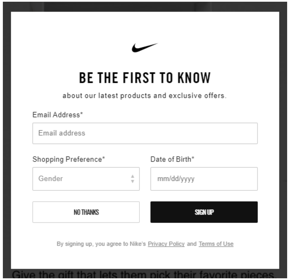
Low Consideration Inline Form Example
Rather than use a subscribe popup, use a Pre-suasion form at the right time in their journey to facilitate an exchange of some personal info for your promise of useful content or advice.
In-line Web Form Influence Pattern
The above example uses many of the Pre-suasion principles; anchor image, social proof, positive affirmation statements, and trust badges.
Gated Content Inline Form Example
Gated content is a great way to facilitate information exchange. But often these prompts hide their gated content intent which thwarts their conversion rate. Rather than surprise the user with a popup form, prize your content as being worthy of the information exchange. Rather, provide them with a clear understanding of what you offer before asking them for some personal info.
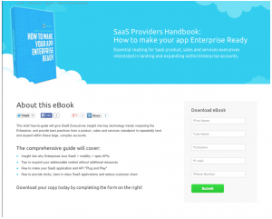
Gated-Content Form
The above gated-content form has a nice priming banner suggesting the information offered is heavenly in a brand-consistent way. It uses Social buttons to enable the user to share with others and a strong outline of the benefits of exchanging this information for some personal info.
Admittedly, I am not a fan of pop-up forms in general. Seventy percent of US users are annoyed by pop-up ads, the conversion rates are low (1-2%), and Jon Reed of Nielsen Norman Group says, “pop-ups, by definition, ruin the user experience.” But while this is all true, a popup form completion can provide useful signals that the brand is resonating with the public, so it’s useful for mature brands.

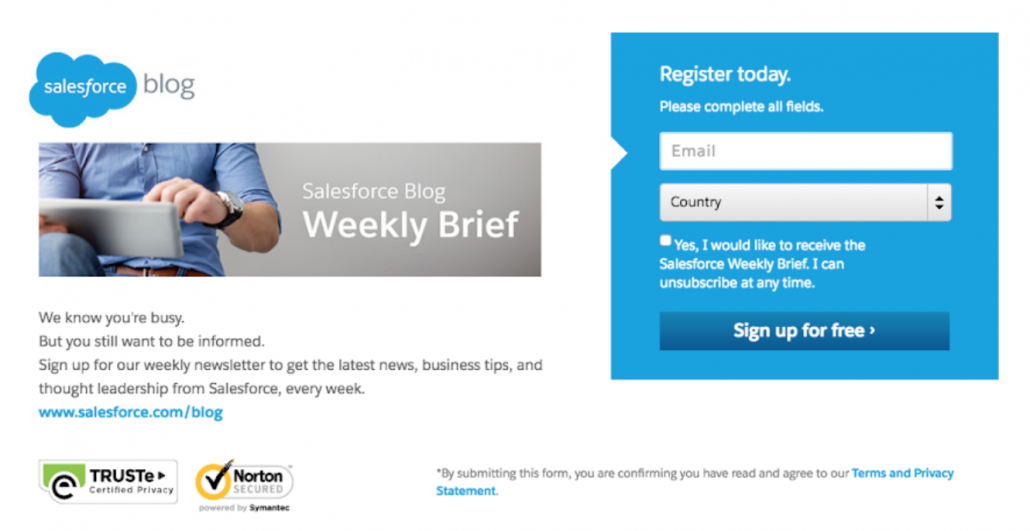
Popup Web Form Influence Pattern
Low Consideration Pop-up Form Example
A subscribe pop-up is common on many websites.
Subscribe popup form on well-recognized brand sites
The brand mark acts as the Pre-suasion element here, a simple benefits statement and the prompt.
See the Journey Mapping Form Article for more info on when to present subscribe pop-ups.
As stated in the introductory paragraph of this article, UX and CRO work hand-in-hand toward the business goals of the website. This section will discuss some of the UX fundamentals of high-conversion rate forms design. Here are the most important best practices that should be part of every form design:
Form Fields – best practices
KISS – Keep questions and controls simple to reduce cognitive load.
There are many great web pages on this topic with many more form design rules, see the citations at the end of this article for some of my favorites.

One of the most important considerations in form completion is the number of form fields presented to the user. As you can see in the diagram, 2-3 three fields are the sweet spot for quick and easy data gathering.
After the field count goes above 5, the conversion rate starts dropping quickly due to consideration of mindset and cognitive load.
Heuristic: The more form fields, the deeper the form would be in the journey.
Rework a Form on your website using the Pre-suasion Design Pattern
The best way to master a new skill is to jump in and do it. So go ahead and pick a form on your website to rework using the Pre-suasion Design Pattern. Put the new design on a new page or pop-up.
A/B Test your new Design
Once your new form is implemented on a test page, A/B Test with your old Form against the new one. Depending on the design of your previous form, you can expect a 5%-15% improvement or more over the old form.

Pre-suasion Influence Pattern
Consider Three possibilities
Lets take a couple of minutes to talk about your web forms and overall website UX and Journey.
Provide me with your name, title, email, website URL and your concern about your website for a FREE mini-assessment. I will return to you ideas on how I could improve your website.
I am interested in your feedback – positive or corrective! Or other articles you would like to see.
